We’d love to hear from you.
Grow and thrive.
An efficient, effortless and effective tool works with you to hit your goals, growing your business across multiple avenues. The GrowScore team saw an opportunity and a potential gap in the market for marketers or business owners not fully understanding what was going on, and why things were happening.
Last year, i’ve been working with the GrowScore team to create a strategic user experience and product along with a visual brand that upholds collaboration characteristics with its clientele, working with clients to assign targets, ensuring those targets are hit and above all else, to grow.


Targets. Targets. Targets.
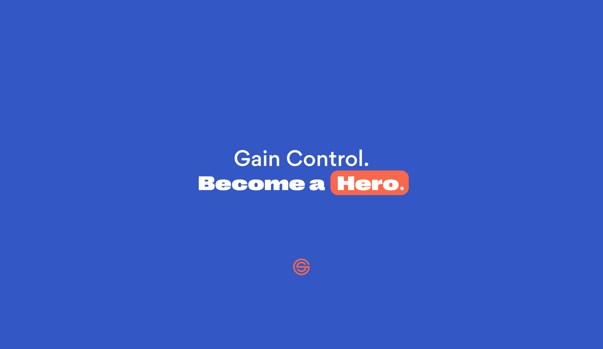
The logo is a simple visual representation of what people most get out of collaborating with GrowScore: hitting targets. The target mark playfully uses the letters G and S (GrowScore), combining to make a target. It’s a confident and dynamic symbol that acts as the core meaning to what GrowScore is, but is also a stamp of authority when used by itself.
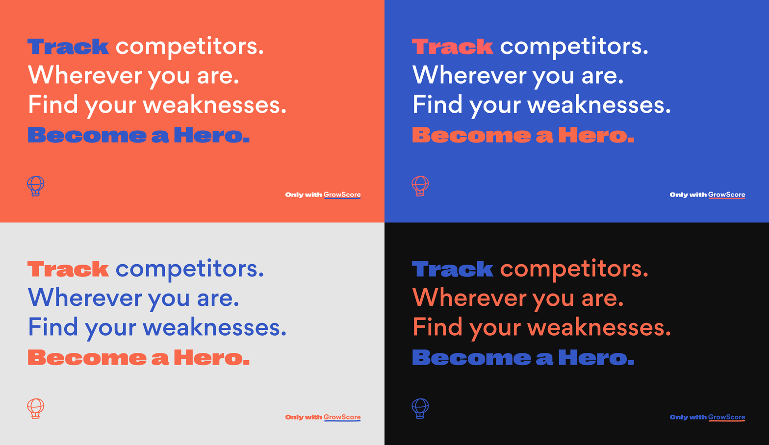
A key asset used throughout the user experience is custom word marque’s and highlighting key words. Understated yet distinctive, the aim was for it to be a strong and confident sign off for the ever-growing brand. With people’s attention spans becoming less and less, really honing in on a couple of words on a splash page or key content, if the user can grasp what is being said from those few amount of words, it’s a win-win for everyone.




Paving the way.
At the core of what GrowScore needed, was a range of personas for prospective clients. As GrowScore is designed for anyone, I needed a way to separate the Marketing Managers from the Founders, or the ambitious leader.
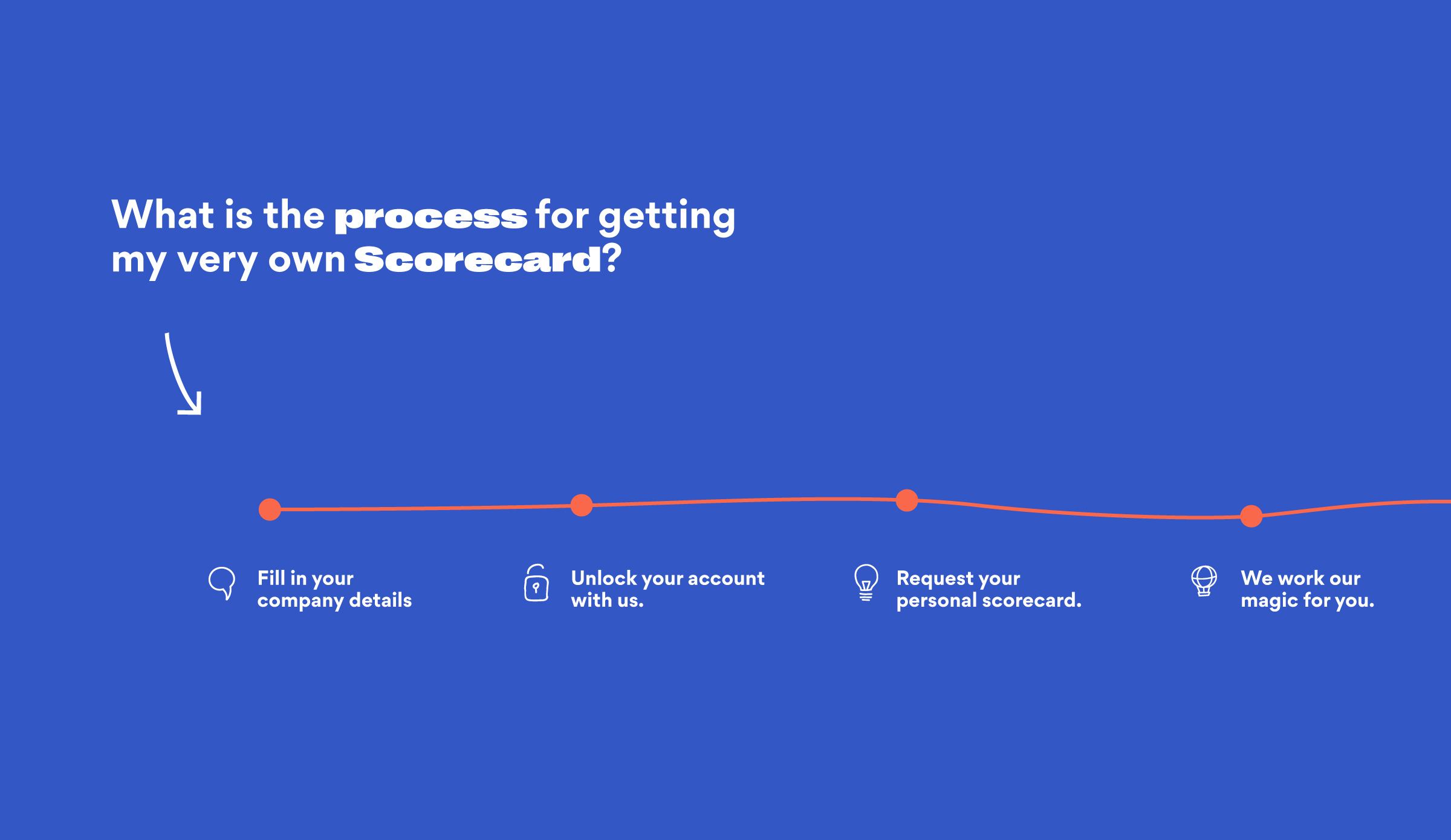
The content changed through language, colour and illustration. At the core of the work I did, highlighting keywords and creating persona-inspired illustrations showing the demographic confused, lost, busy or the hero.
