We’d love to hear from you.
I am Alex Fettling.
I have branding and visual communications designer origins.
However, I have been a digital and product designer for close to seven years. Working with major Australian brands to local start-ups across a range of sectors like; FMCG, manufacturing and eCommerce.
Working as a lead digital designer, project lead or part of a working team. I have successfully founded a branding and user experience studio and co-founded a digital design and development agency. I have done anything and everything between conceptual ideation, project management to User Experience and User Interface design as well as animation, QA, testing and development.
I’m looking for my next challenge.
Let’s look at some case studies.
Below, I have prepared some case studies that best reflect my experience and aesthetic style when attacking a digital project or product.
Each project has a resolved result from a situation or problem, the items outlined below show my process for reaching each resolution. Before starting each project, I completed research components around analytical data, aesthetics and user interviews to better understand each brief, business goals and best journey for the user.
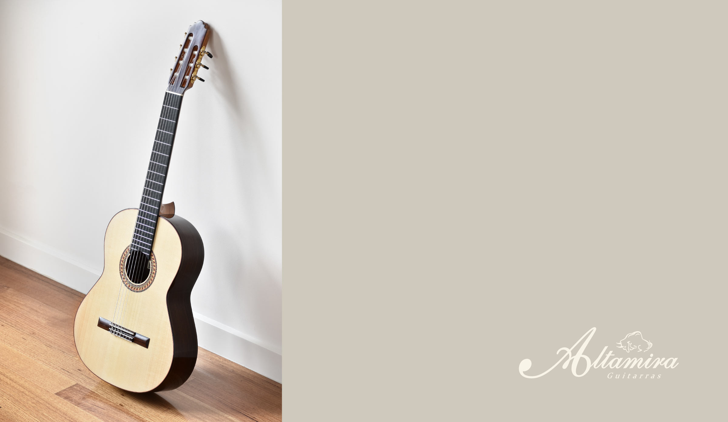
The situation with Altamira Guitars.
Altamira Guitars is a leader in handcrafting traditional classical nylon string, historical replica, and gypsy jazz guitars.
Altamira had a Squarespace website in the past. There were some user experience issues relating to getting the right content into the hands of the user and no coherent user journey strategy. The content, page structure and overall style needed redesigning to better connect with its audiences and users. With the goal to build a more intuitive information architecture and developing a coherent visual language and style with users was the main goal; to represent and enhance the Altamira Guitars brand as a whole.

Task.
I was tasked to solve the issue of the information architecture and user journey, to declutter the content on the pages and implement a User Interface that reflects the beautiful construction of each guitar to inspire action and interaction with users.
I starting with questions.
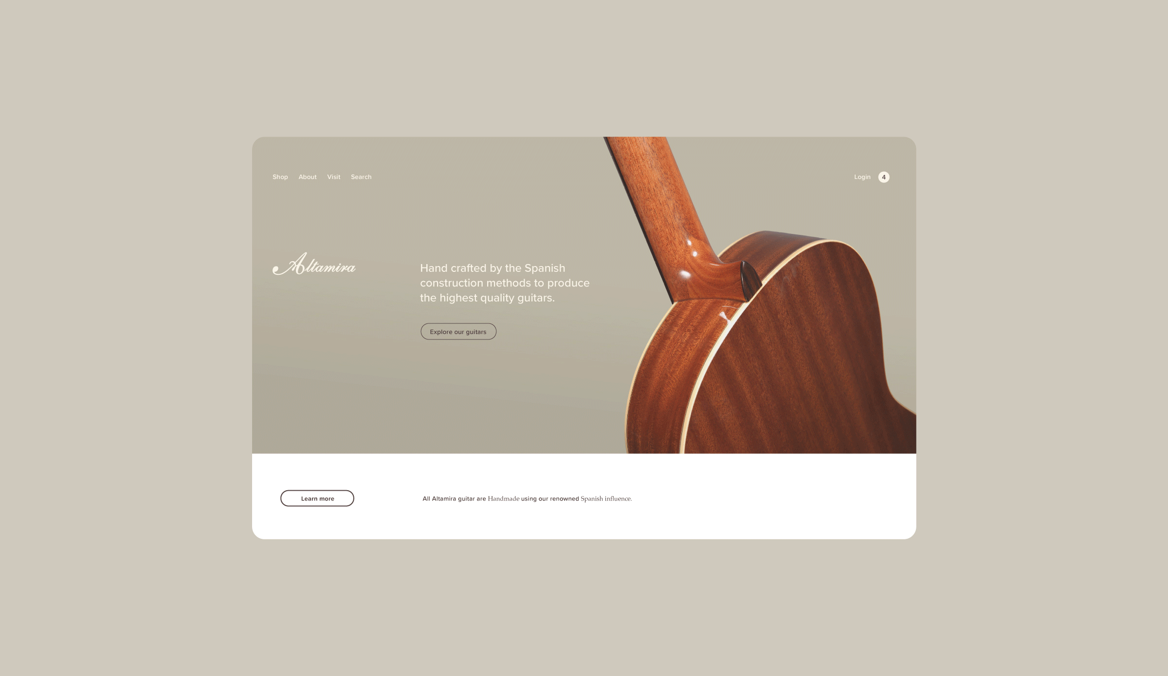
I undertook a range of stakeholder workshops to better understand any requirements and to get a sense of how Altamira Guitars was perceived internally. It was clear that the digital representation (website) of Altamira Guitars was not clearly reflected on the beautiful and hand-crafted construction of each guitar. The interface, typography, colour palette and imagery just didn’t pack enough punch and simply left the user wanting more.
Analytical data research uncovered a high bounce rate and 75% of users not accessing other pages or pursuing through all the content on pages. Assuming users weren’t interacting with the content, disinterested in the content or simply weren’t finding what they were looking for.
Action.
With input from senior stakeholders and users of the website and their products, I comprehensively rearranged, styled and enhanced the content on each page, produced a user journey that inspires action and invigorated a tired theme into a sophisticated canvas for the future. With a suite of design systems set in place, ensuring the website is future-proof.
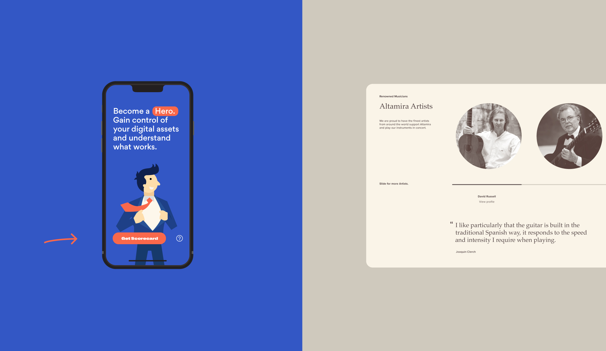
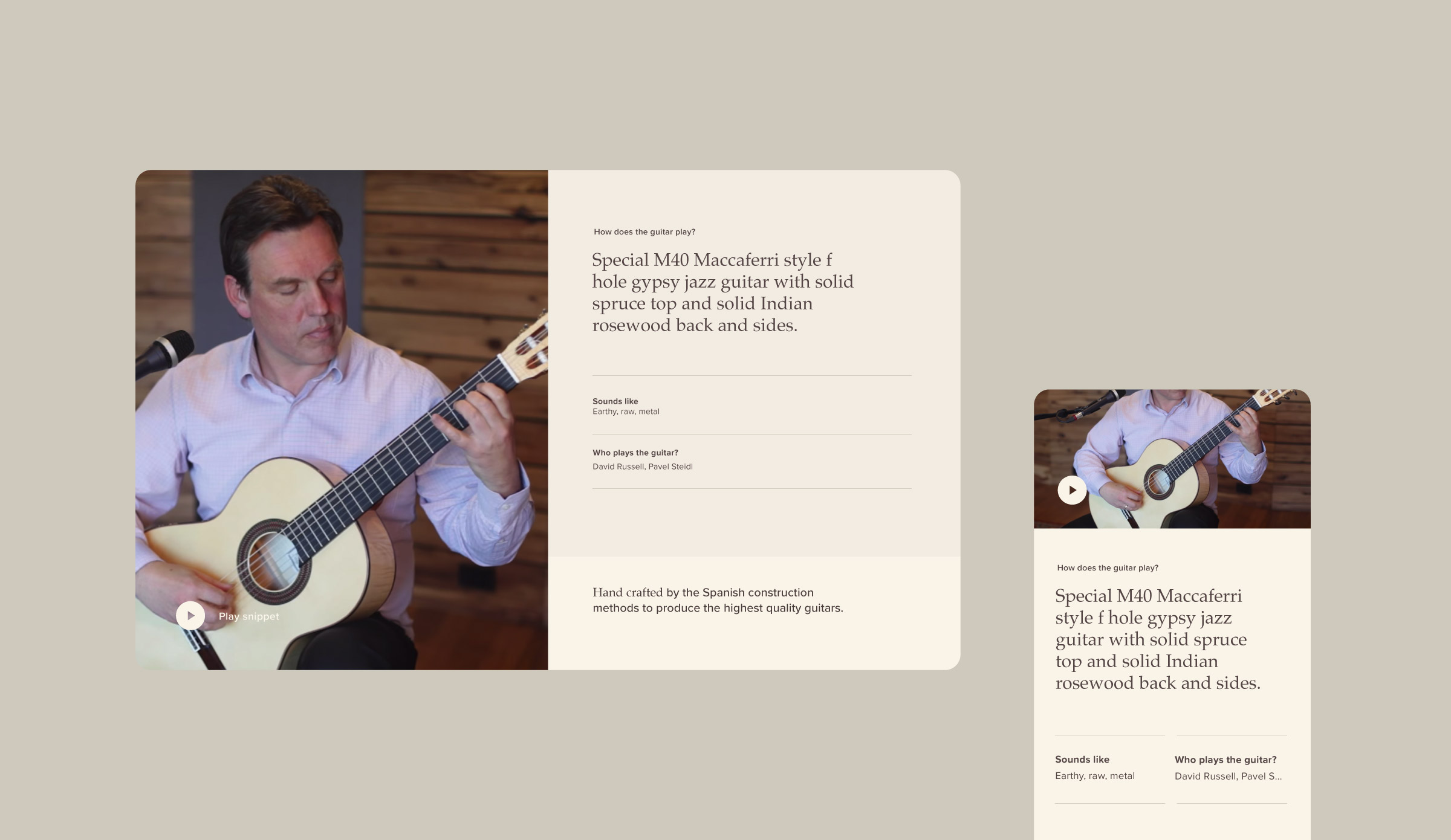
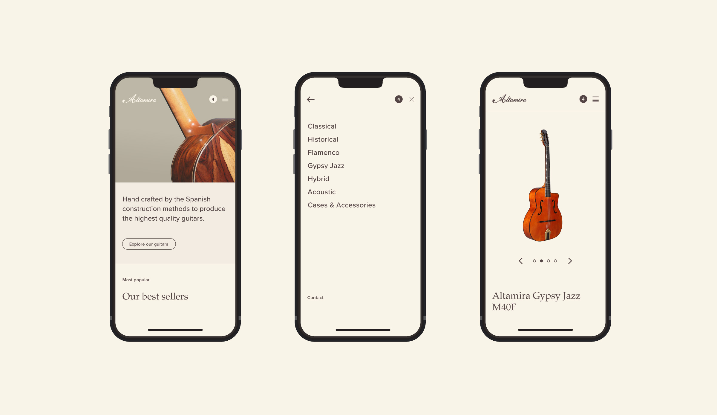
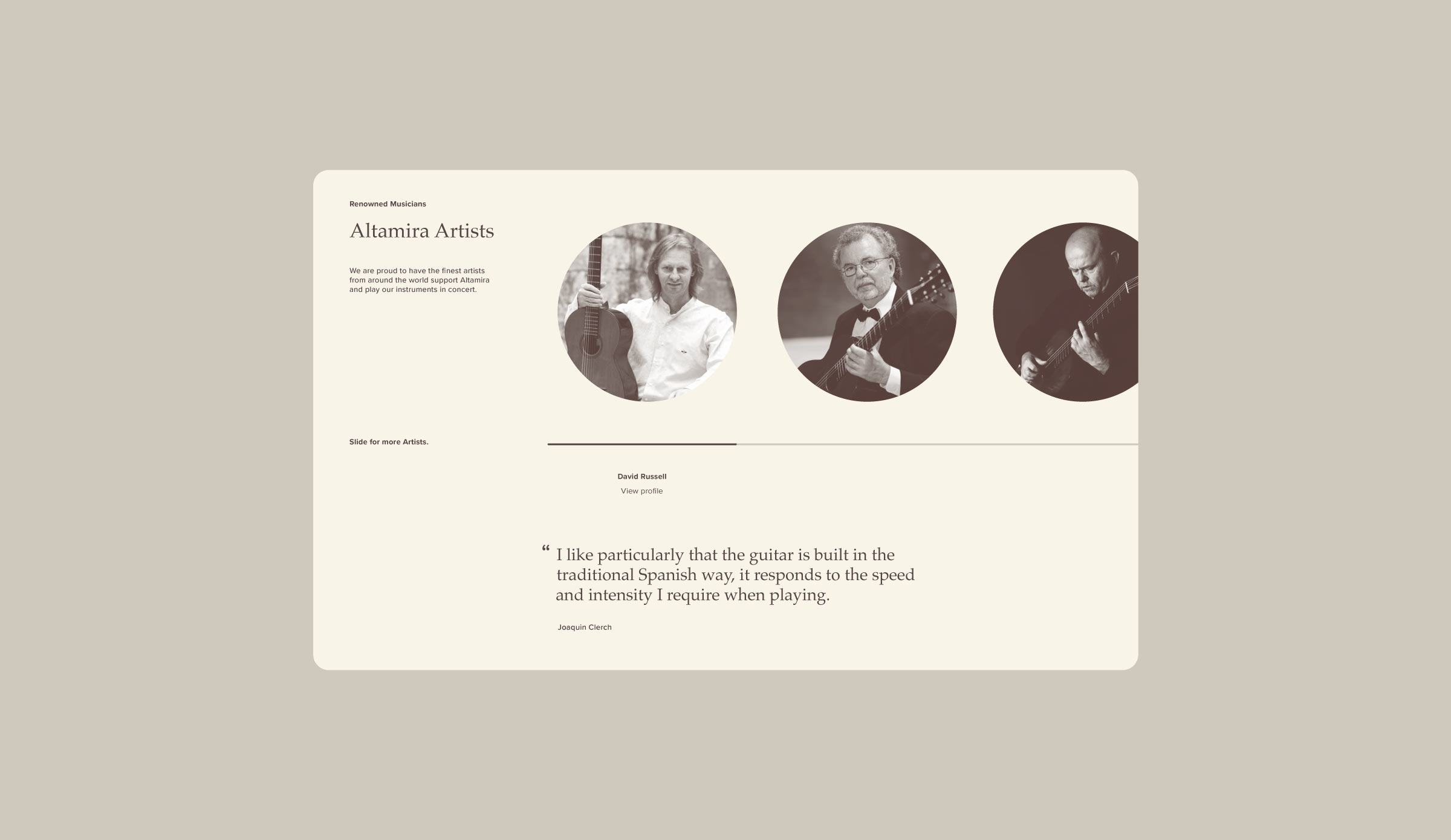
After constructing user interviews early on in the project and auditing the results, a major pain-point for users was not being able to efficiently view all of the products. I produced an efficient and elegant navigation experience to display all products and categories into a comprehensive database; all accessed with no mouse clicks, just a mouse hover and sliding effects (using the mouse or keyboard). Effects and motions like that of playing a guitar.
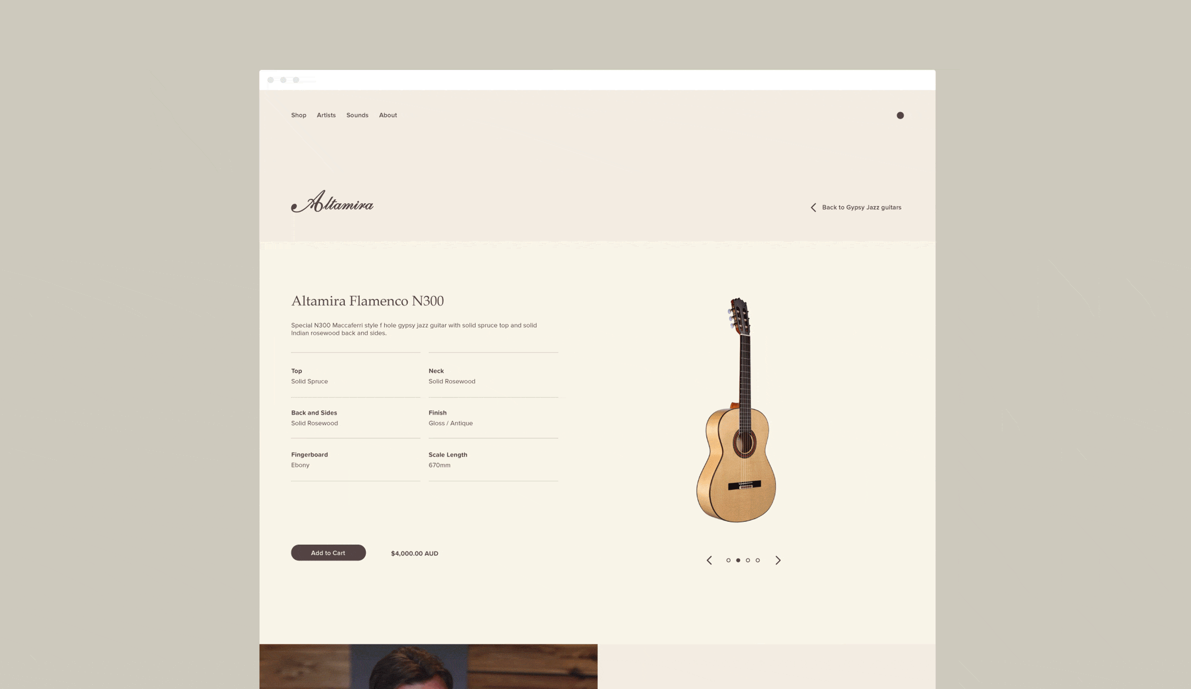
As well as a general style revamp, a major pain point was the information and layout of content on the product detail pages. There was no sense of hierarchy and no sophistication when it came to which piece of content to get in front of the right eyes.
That all changed.
Responsive.
With mobile taking up a significant percentage of the users of the site, I started with a mobile-first approach when prototyping and fleshing out interfaces. Ensuring the experience is just as good (if not better) on a mobile device than a desktop.
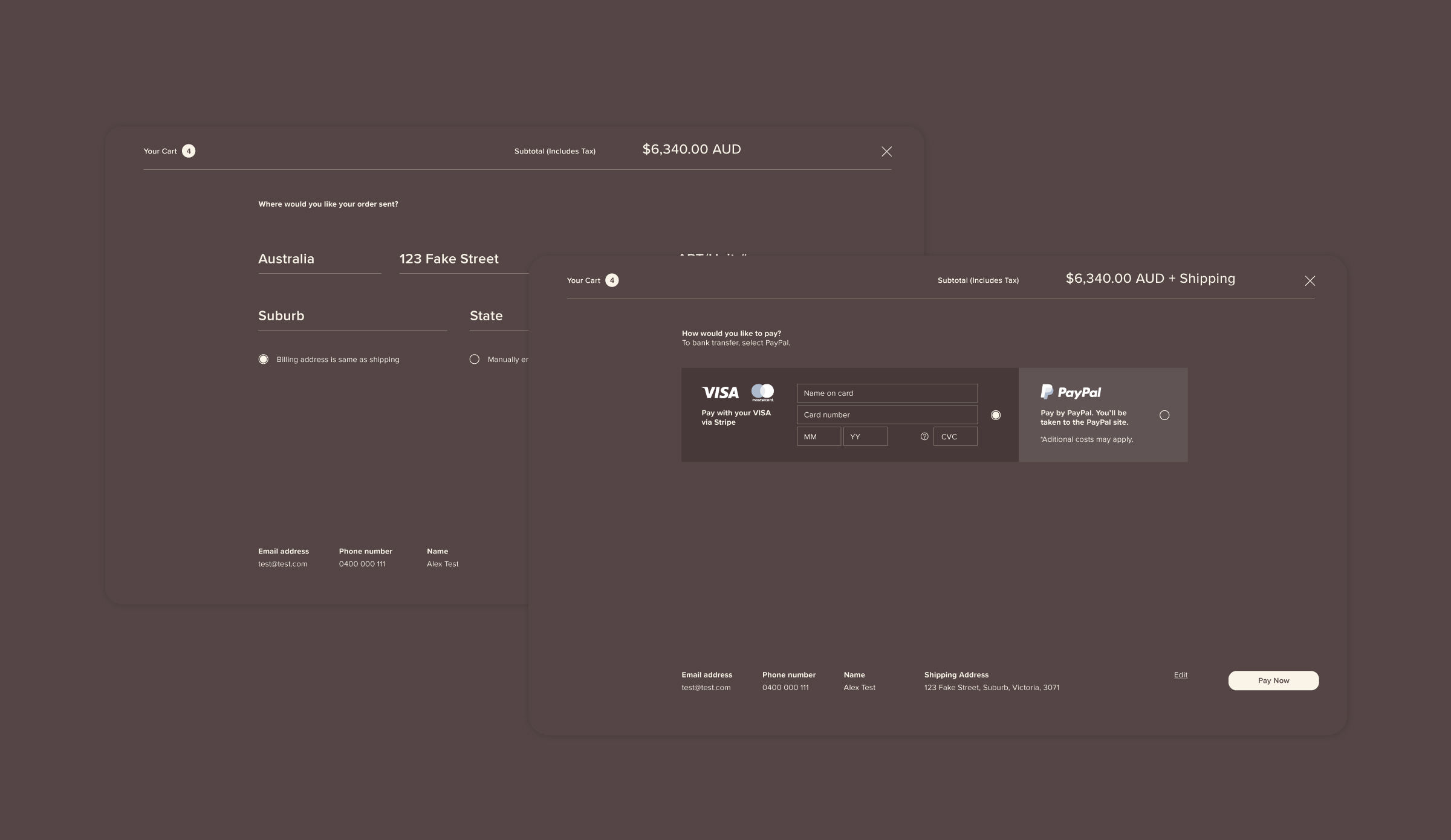
Given the nature of the product and the costs involved, the checkout system required an overhaul to show trust and authority. Through customer research, users wanted to feel comfortable their heavy investment was going to be worth it and wanted a streamlined checkout system.
Results.
Since pushing these experience updates live, Altamira has gone from strength to strength. From a significant time difference from people staying on the page and interacting with the content, to an increase in total sales and revenue.
Users also felt the sophistication of the overhaul style of the website implied the products themselves were of a premium, leading to a greater brand awareness and user sentiment.
Stakeholders were extremely happy with the outcome, excited for the future. An invigorated new website to use as a launching pad to catapult into the future, knowing their website is now a true reflection of their company and products.

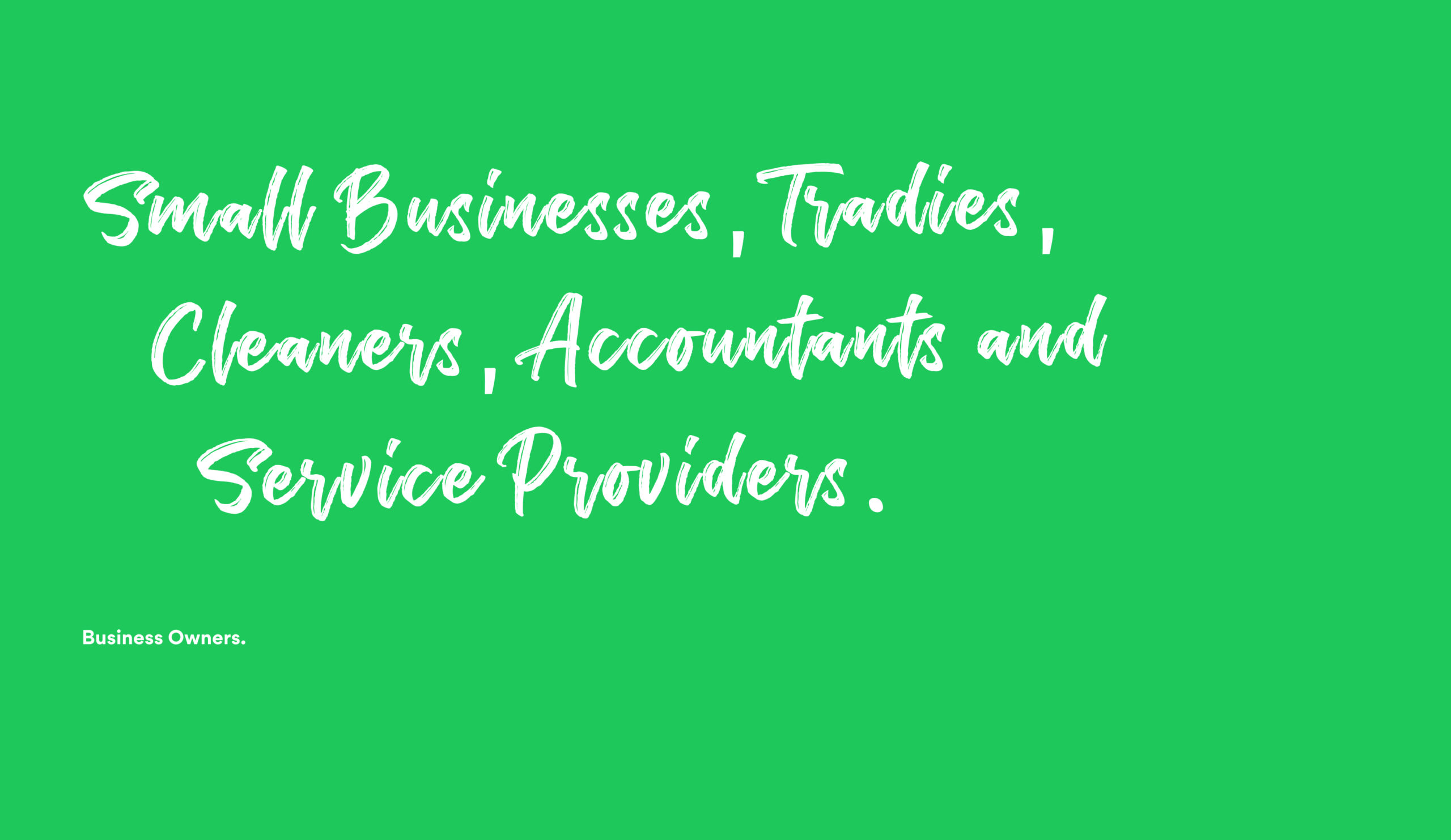
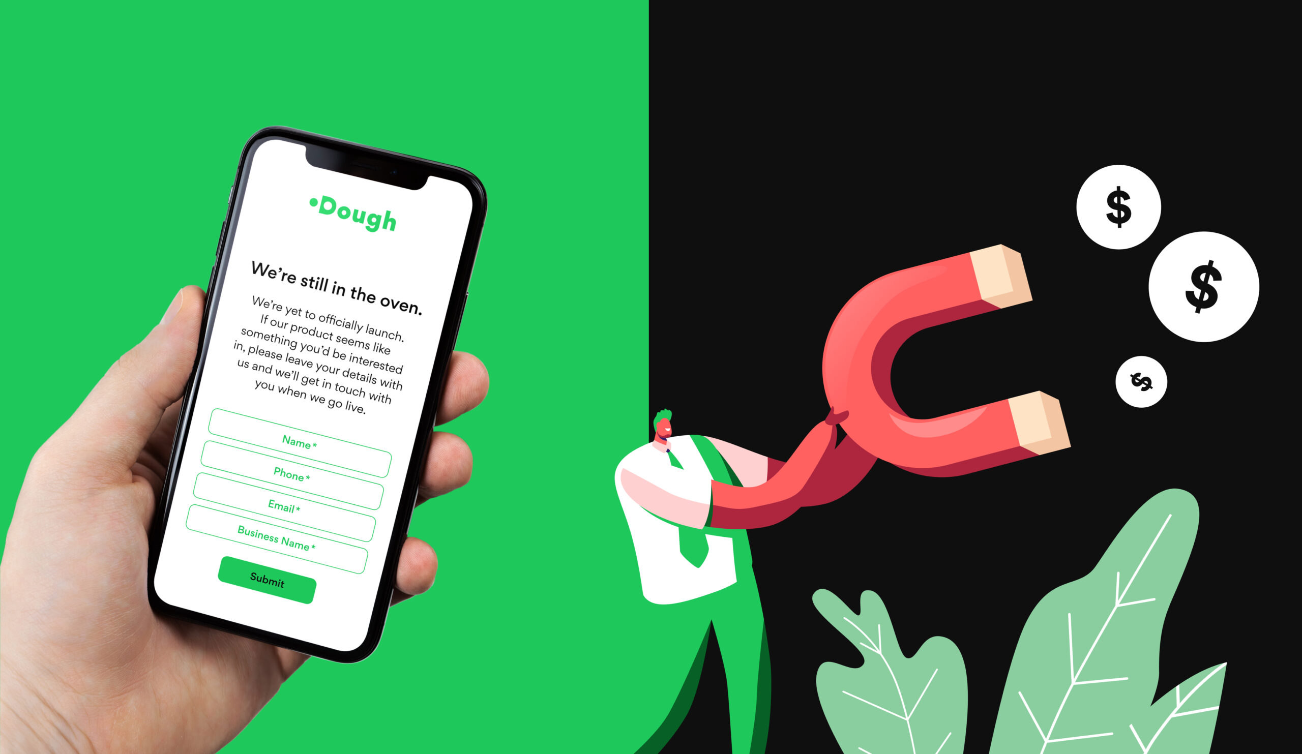
The situation of Dough.
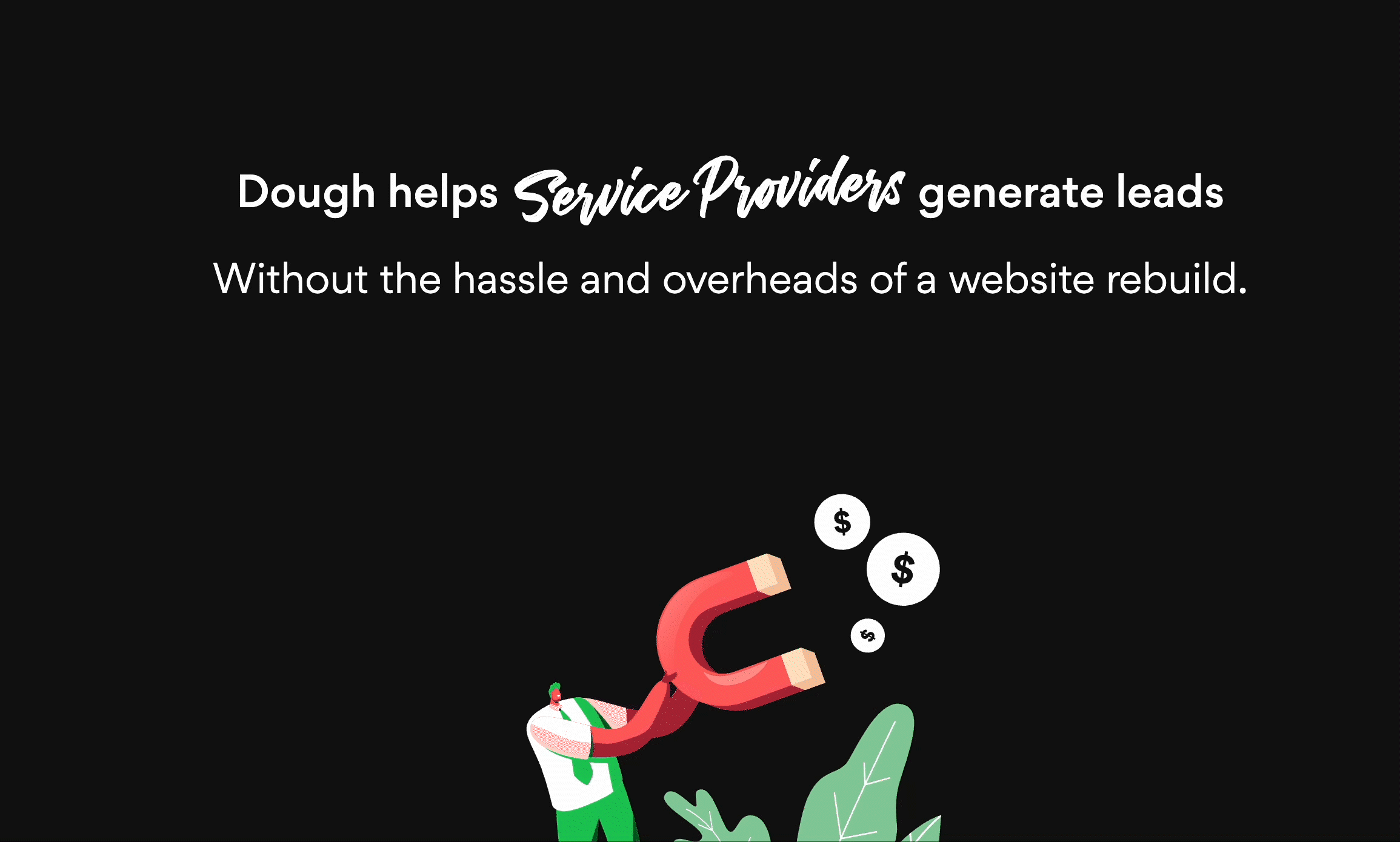
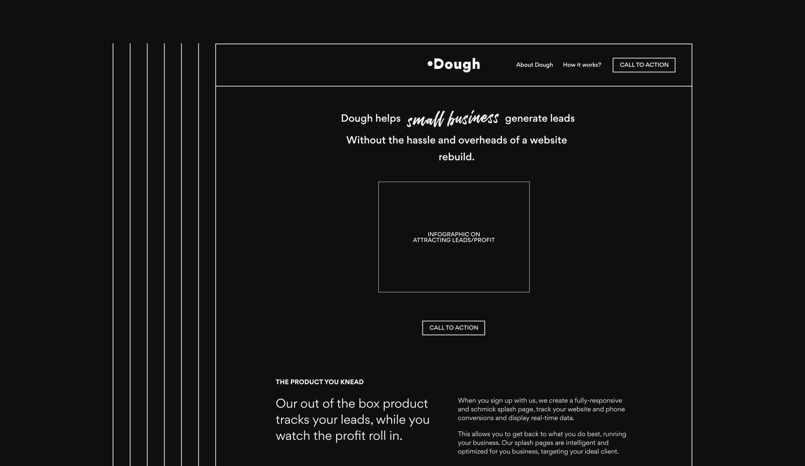
Dough is a SaaS product that gets leads for you, tracks them, while you watch the profit roll in. Dough was created to eventually take over the mantle of the Yellow Pages and advertise businesses for the modern era.
I was given the green light to undertake a suite of desktop research, uncover direct and indirect competitors and undertake a full marketplace audit. Once complete, I built the product from the ground up—through naming, copywriting, branding, experience and interface design for a lead generating splash page to inspire and generate leads.

Task.
With comprehensive marketplace research complete, there was a clear gap in the market—there was saturation of tech-y language and businesses claiming the world with not a lot of validation.
The market was crying out for a simple and easily digested tool, with no fluff. I produced a piece direct, simple and slightly cheeky.
Using that notion of simple, straight to the point aesthetics, the interface, typography, colour palette and illustration were produced from scratch. Going through rigorous user testing on language, style and call to actions.
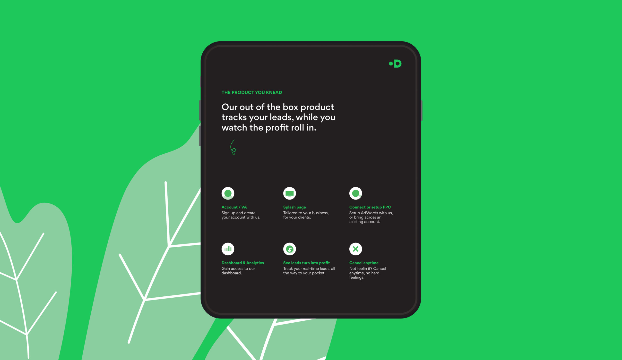
Action.
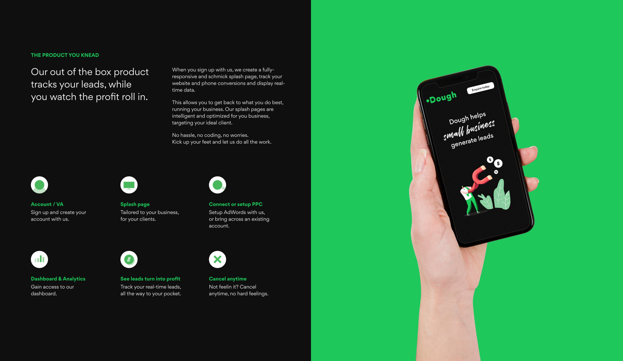
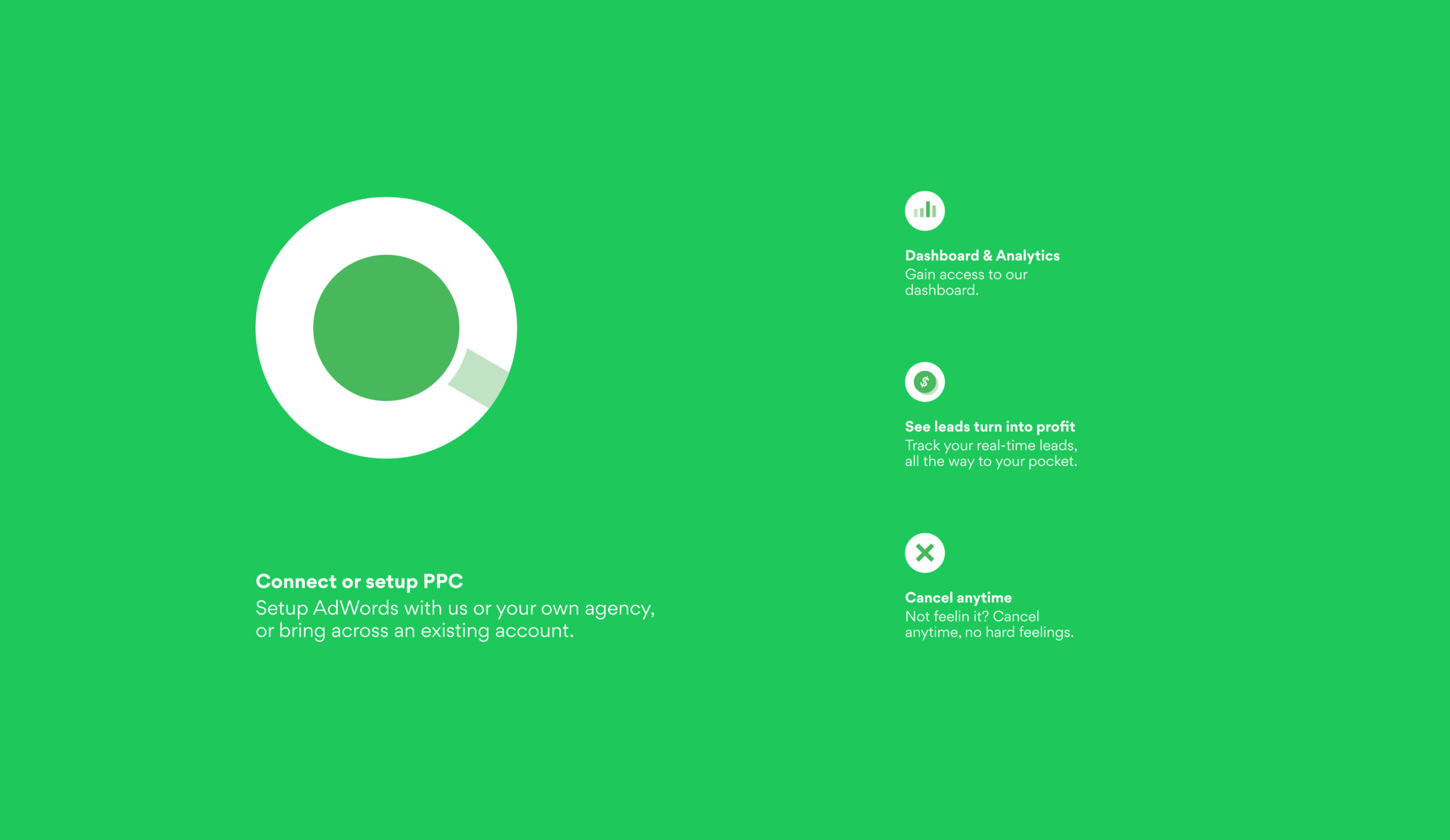
Presenting a fully-functioning prototype for multiple user experiences, and multiple on-boarding user-journeys. Whether the user was coming in via PPC, social media or organic, it was pivotal to have a content strategy tailored towards the user and their journey origin. Creating persona’s based on extensive research, I laid out a clear path and strategy for each user demographic and journey by either onboarding or educating users depending on whether they were ready to commit.
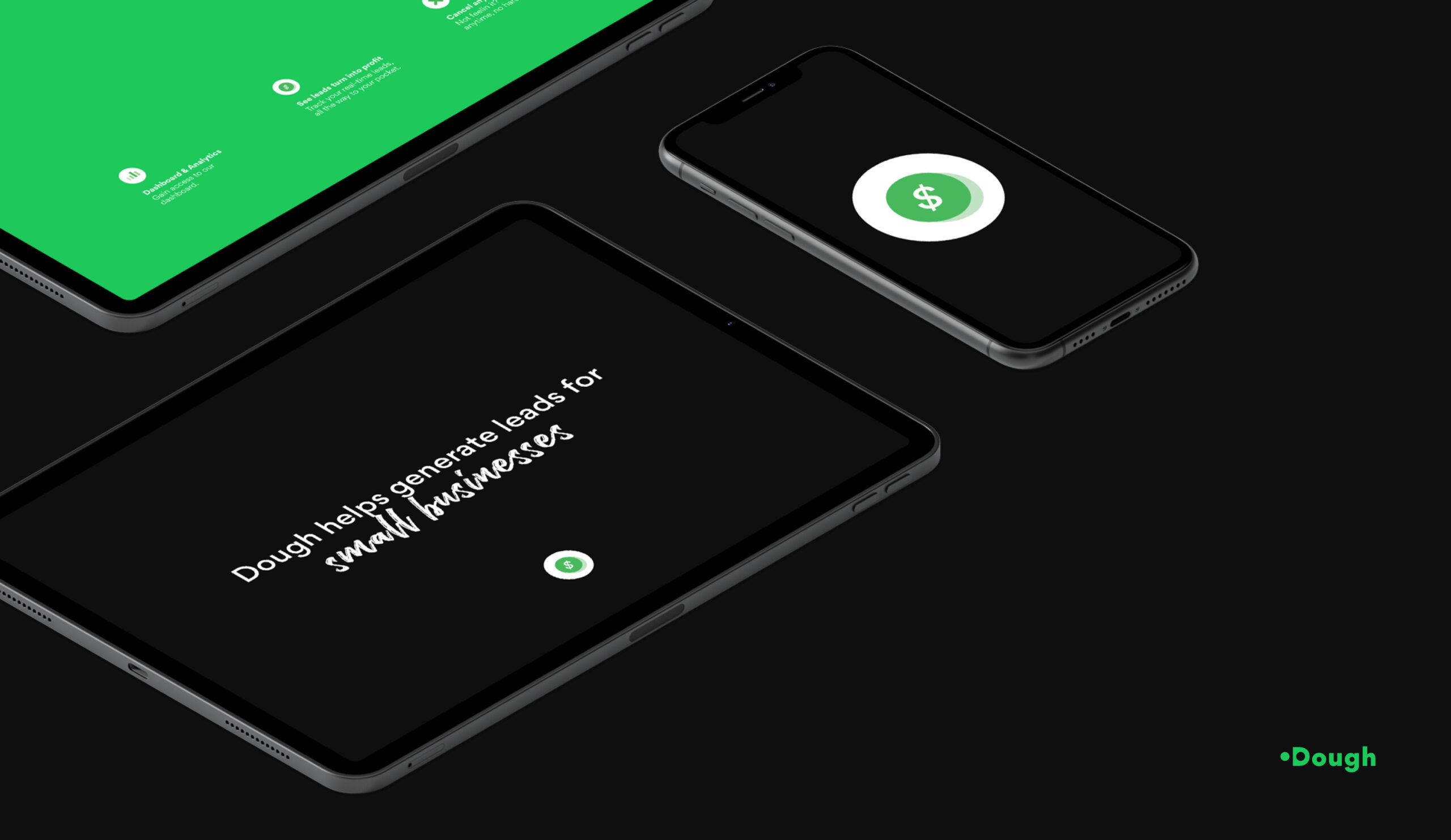
The experience I created is simple, clean and sophisticated; much like the messaging and aesthetic. The dark theme is easy on the eye and makes the colour green which symbolises profit and money, play the hero.
Results.
Since creating these experiences, Dough has seen a significant amount of user interactions and expressions of interest to onboard into the product. This was pleasing to see given the product is in its infant stage still and proves that the research undertook early on outlined a clear path forward.
Users also felt the aesthetic and interface implied the product knew what they were doing and weren’t trying to mislead users. It was easy to use and easy to understand. Stakeholders were extremely happy with the final outcome and were confident there was a position for their product in the market, to hit the ground running once implemented.

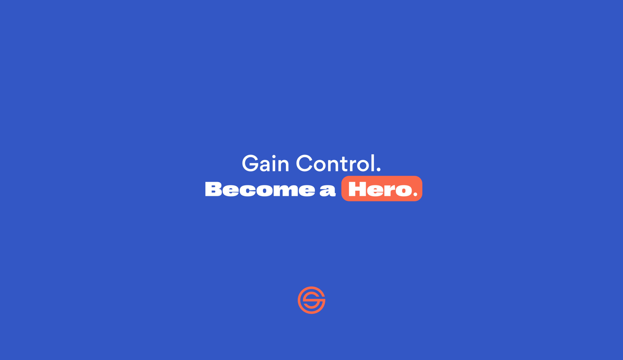

The situation with GrowScore.
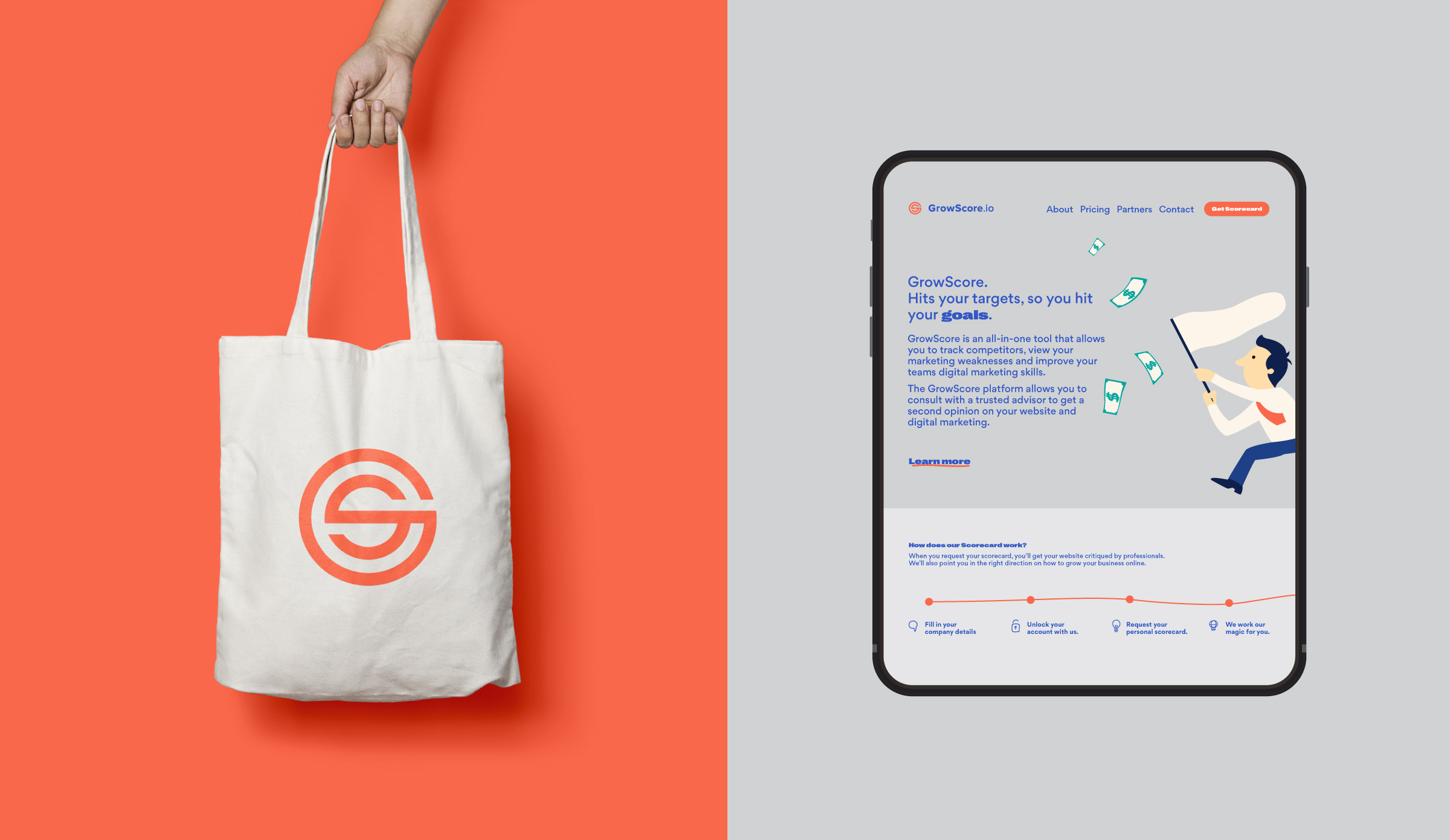
GrowScore is an efficient, effortless and effective tool that works with you to hit your goals—growing your business across multiple avenues. The GrowScore team saw an opportunity and a potential gap in the market for marketers or business owners not fully understanding what was going on in their business and why things were happening they way they are.
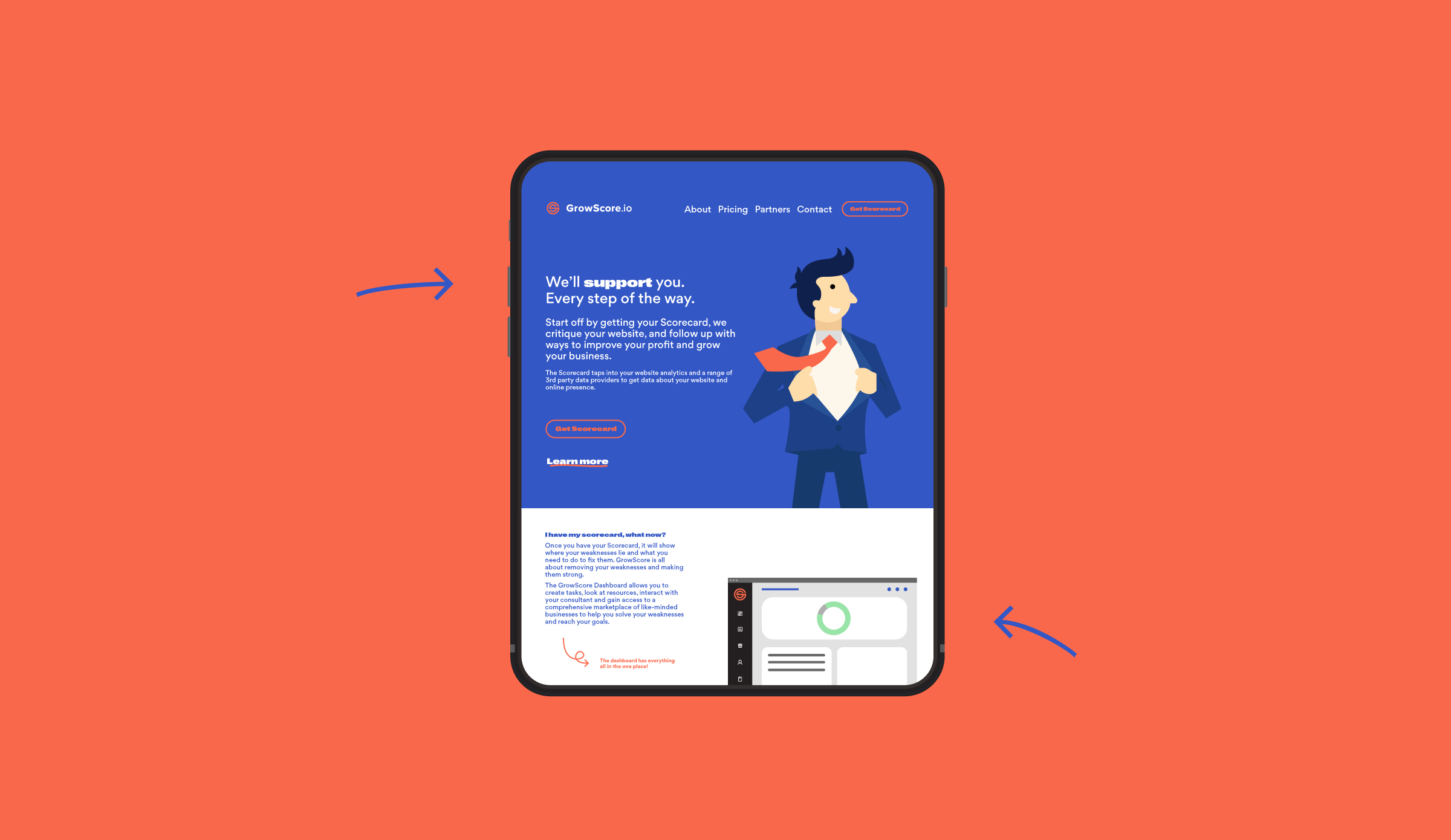
I worked with the GrowScore team to create a strategic user experience and product along with a visual brand that upholds collaboration with its clientele. GrowScore works with clients to assign targets, ensuring those targets are hit and above all else; to grow businesses.
GrowScore hadn’t really found its feet in the market and wasn’t attracting the right type of people to use its product.
That all needed to change. Strategically.
Task
It was pretty clear early on with workshops and stakeholder consultations that GrowScore was crying out for clarity on its users. I produced a range of personas for prospective clients and users of their product.
As GrowScore technically, is designed for anyone. The focal point became clear there were core user groups like; marketing managers, founders and ambitious leaders of industry. There was no clear way to target them individually.
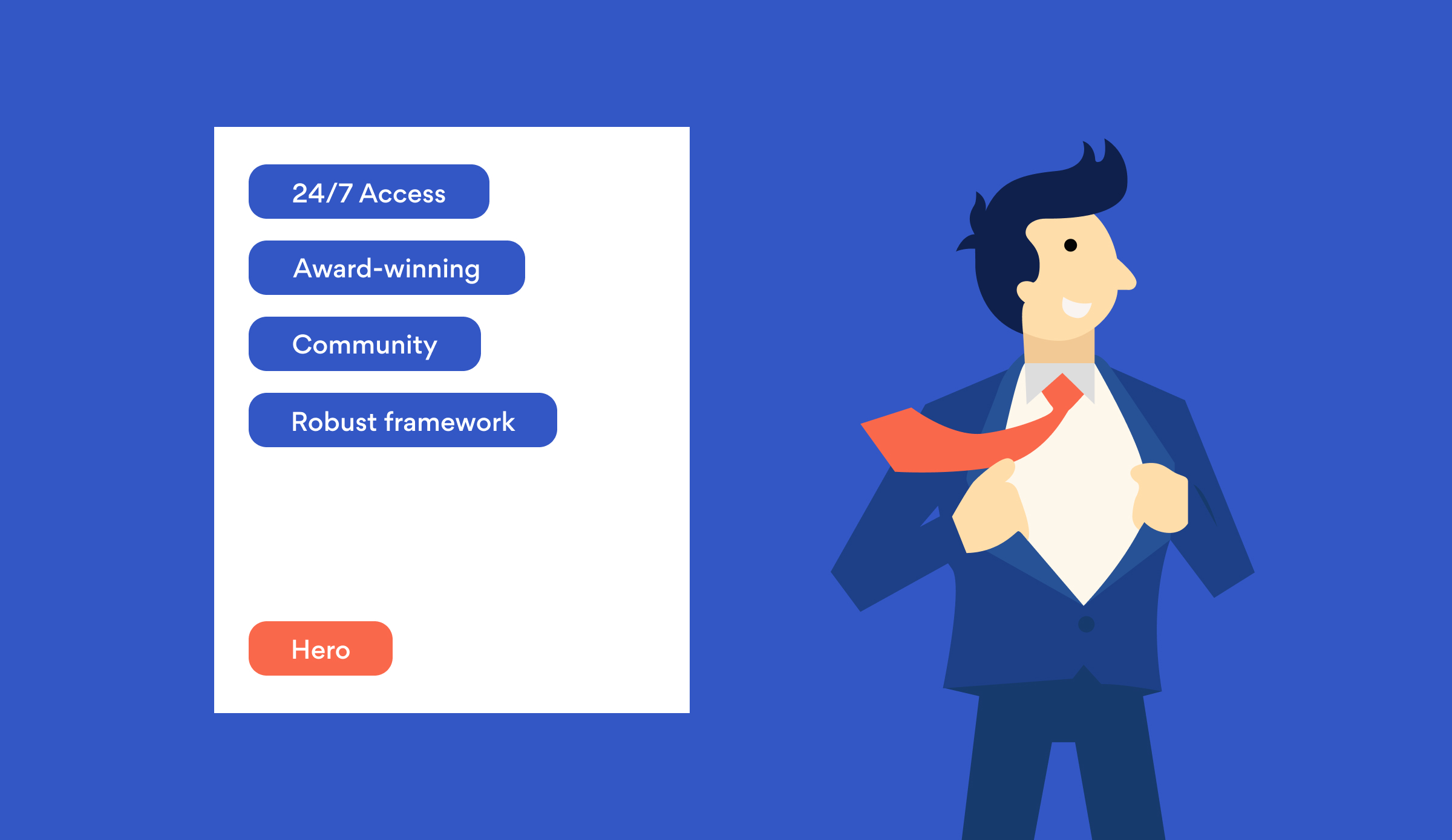
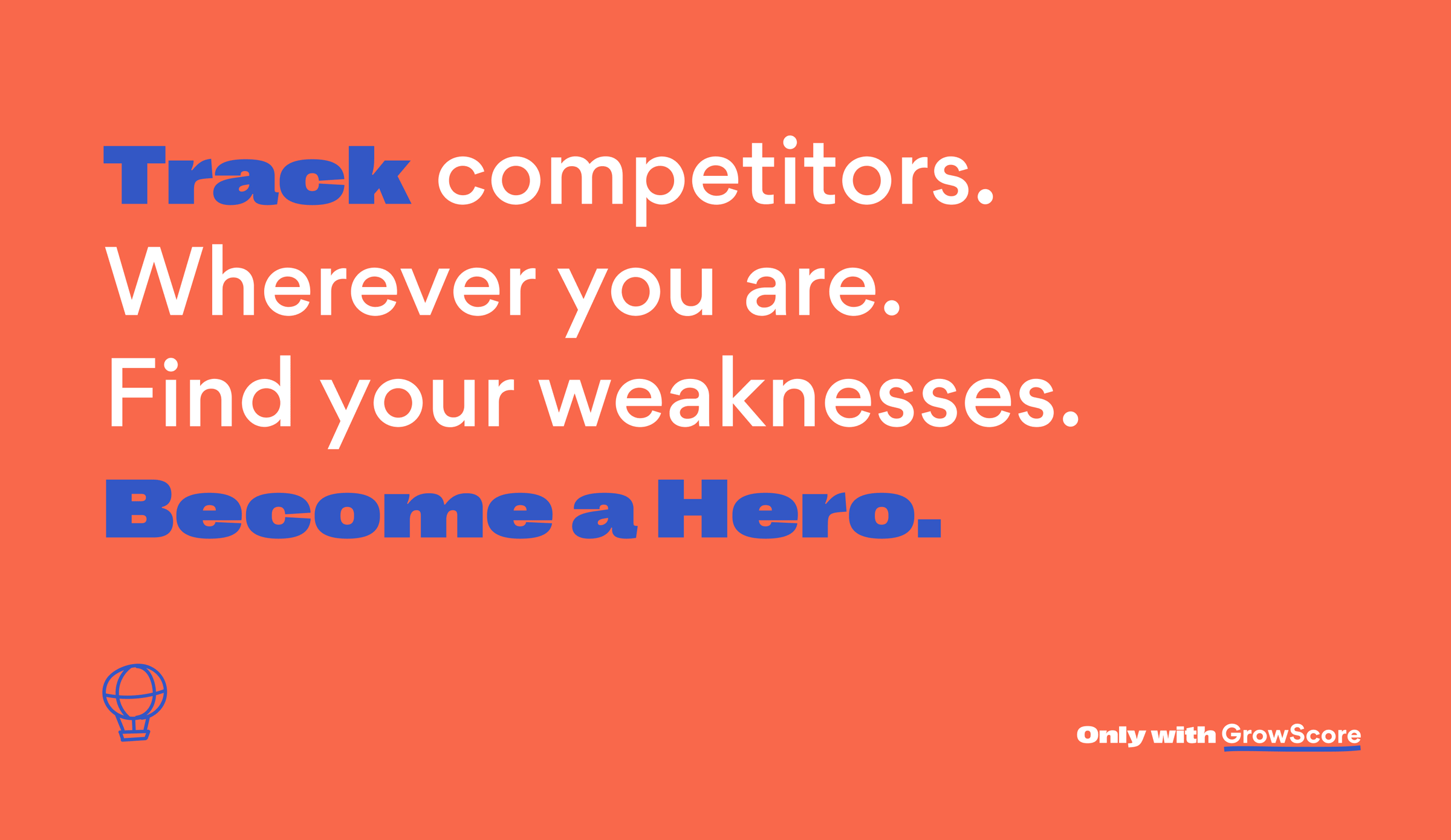
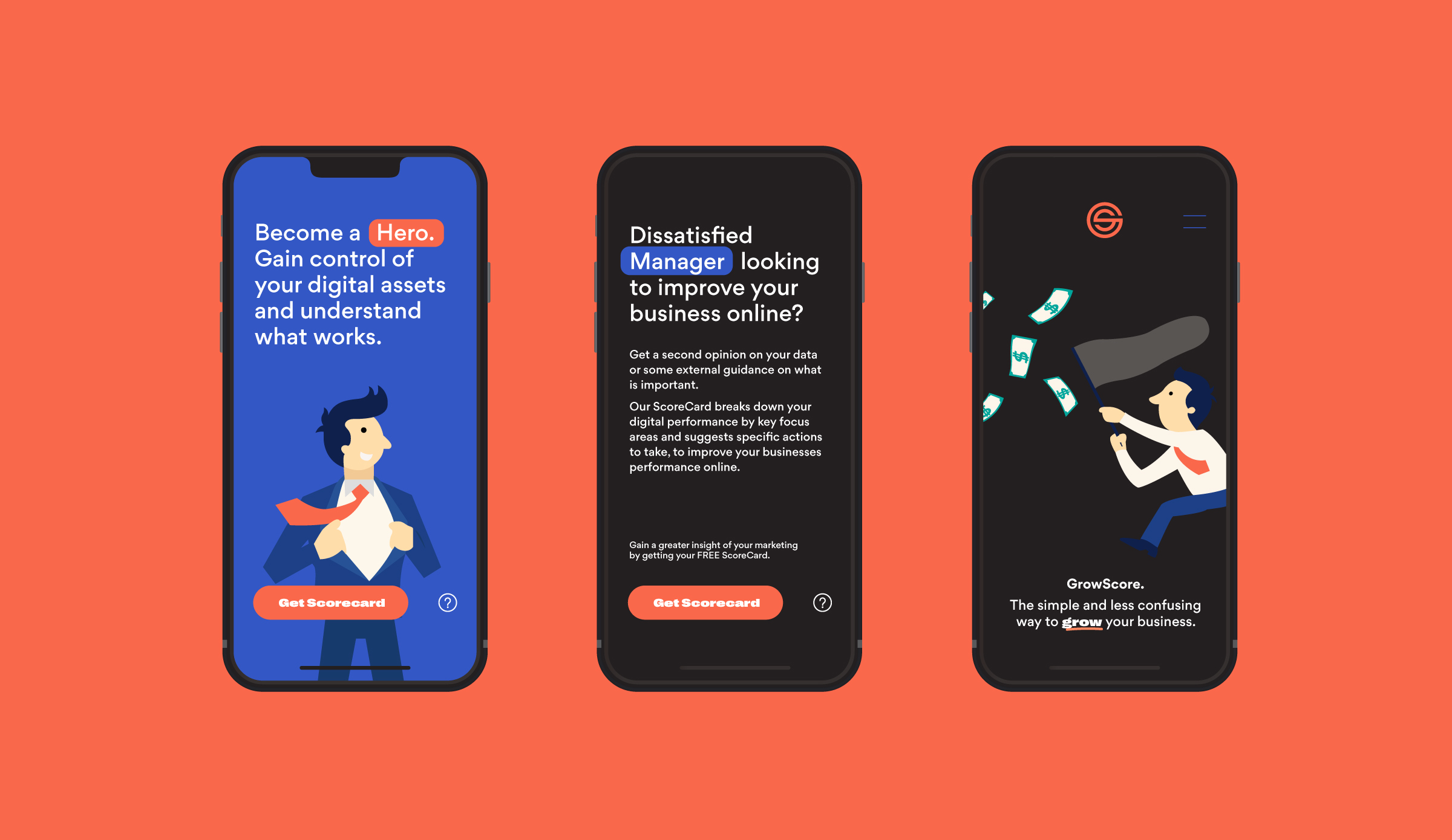
The user content pieces changed through language, colour and illustration (depending on the intended user). At the core of the work I undertook were highlighting of keywords and phrases to initiate bite-size content, persona-inspired illustrations showing the user emotional; through being confused, ecstatic, busy, or a hero. These pieces became mainstays throughout all marketing collateral and digital pieces.
Action.
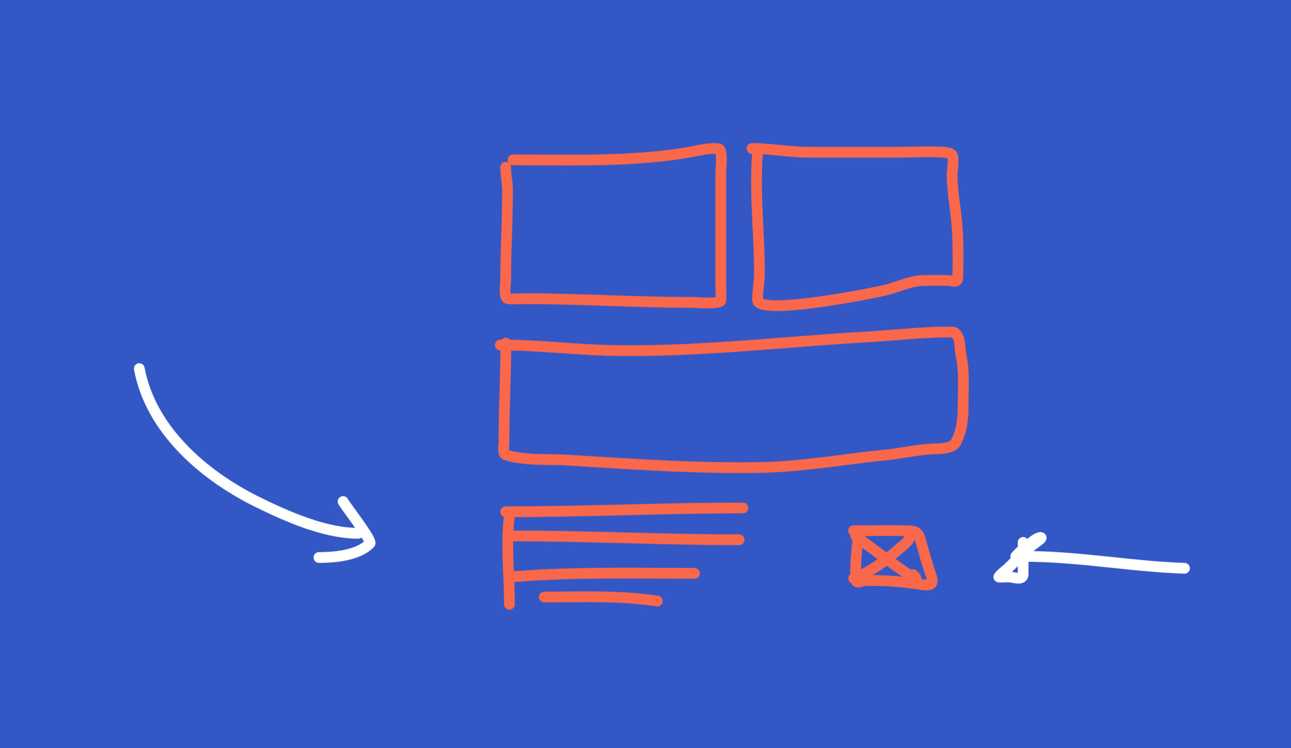
The process for reaching the finished outcome required an experimental deliverable of; generate a prototype, test, amend and repeat. Ensuring there were no gaps in the user journey, no pain points left severed.
Presenting a suite of fully functioning Figma prototypes to QA and AB test with stakeholders and users to then producing fully functioning digital assets, illustrations, iconography and digital products read for engineering.
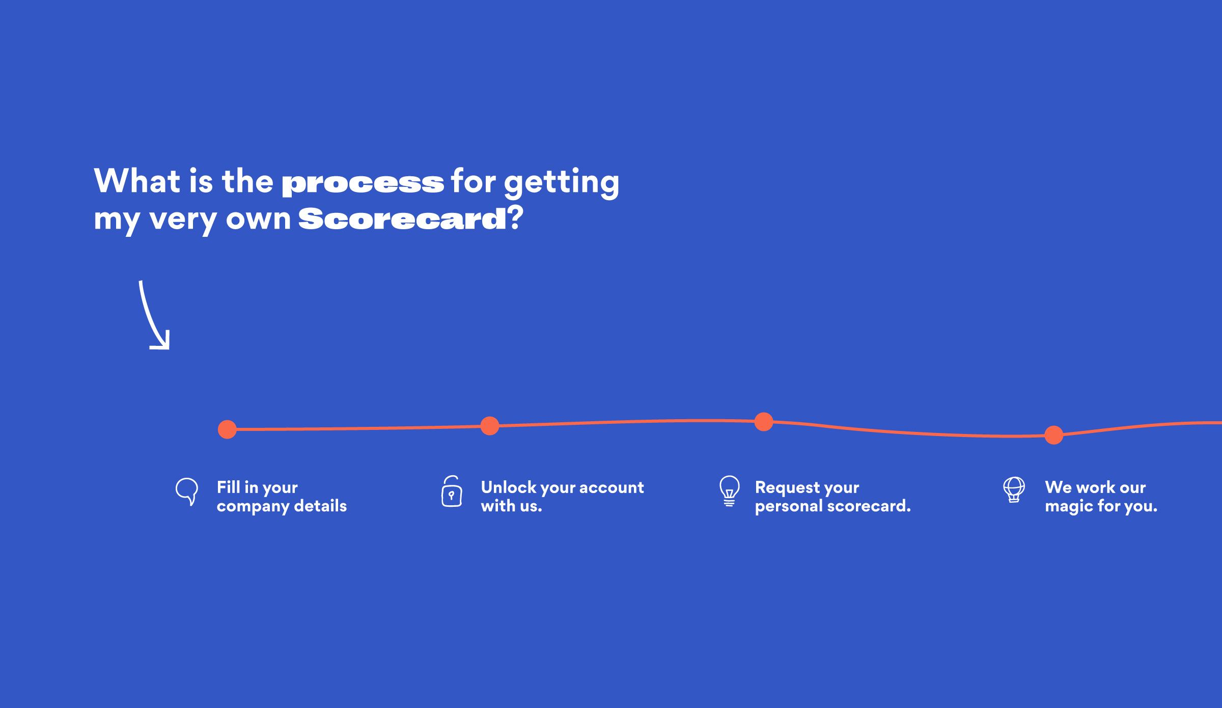
GrowScore’s tool (A digital Scorecard) was the start of the onboarding funnel, however this was also the main road-block for users not following through and converting. It was clunky, unclear and confusing. I wanted to ensure the process for acquiring a scorecard for users was effortless, streamlined and as simple as possible.
Results.
Since inception, the product has found a steady stream of users signing up to the platform, analytical data shows users converting at a high rate, which is really exciting.
Internally they have been able to utilise and track each journey a user has undertaken and assign the right resources to the right user and business, keeping internal workflows and labour to a minimum.
Aesthetically, users have thoroughly enjoyed using and interacting with the products, they’ve shown a decrease in bounce rates and have shown an increase of users staying on the page and engaging with the content.
Page events have pleasantly tripled with the amount of engagements and sign-ups since implementation of the new experiences.

Paving the way.
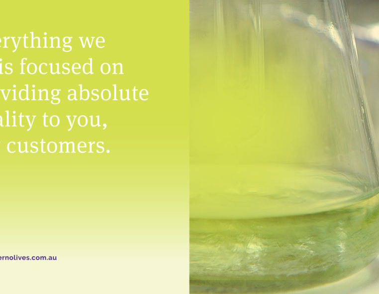
Modern Olives is a leading provider of technical services to the olive industry, located in Lara, Victoria. It focuses on providing absolute quality service to their customers and contributing to the modern olive industry. It’s enriched with a plethora of testimonials and job numbers, Modern Olives is definitely the industry leader in the technical services of the olive industry.


Discover our thoughts on the industry and and gain a greater understanding on how we think via our Journal.
View all Journal posts